CourseRoll:重新定义 NYU IDM 学生的选课体验

CourseRoll:重新定义 NYU IDM 学生的选课体验

My responsibilities
  1. 主导端到端设计流程,从用户研究到最终 UI 交付

  2. 开展用户研究、市场调研与可用性测试

  3. 制作线框图与交互式原型

  4. 构建设计系统并完成规范文档

The impact

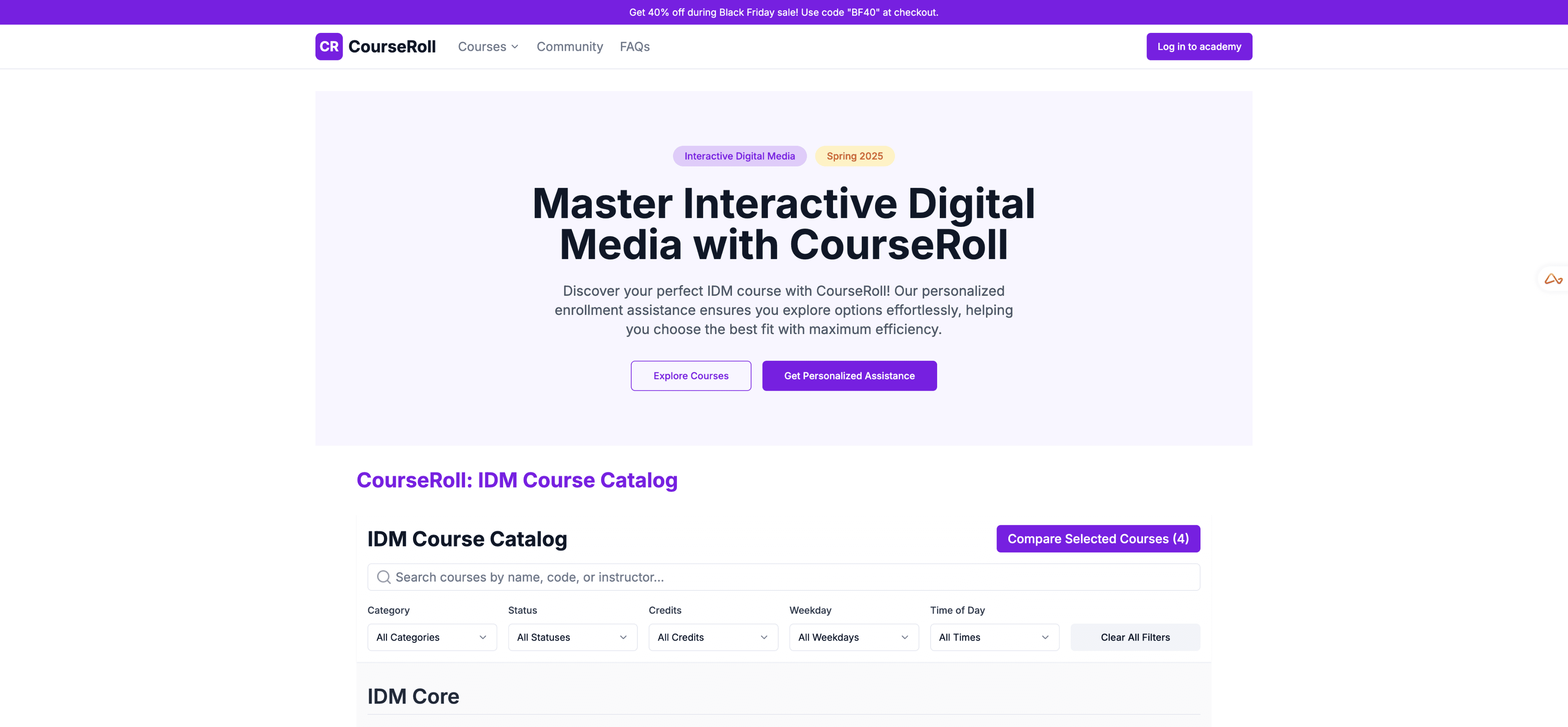
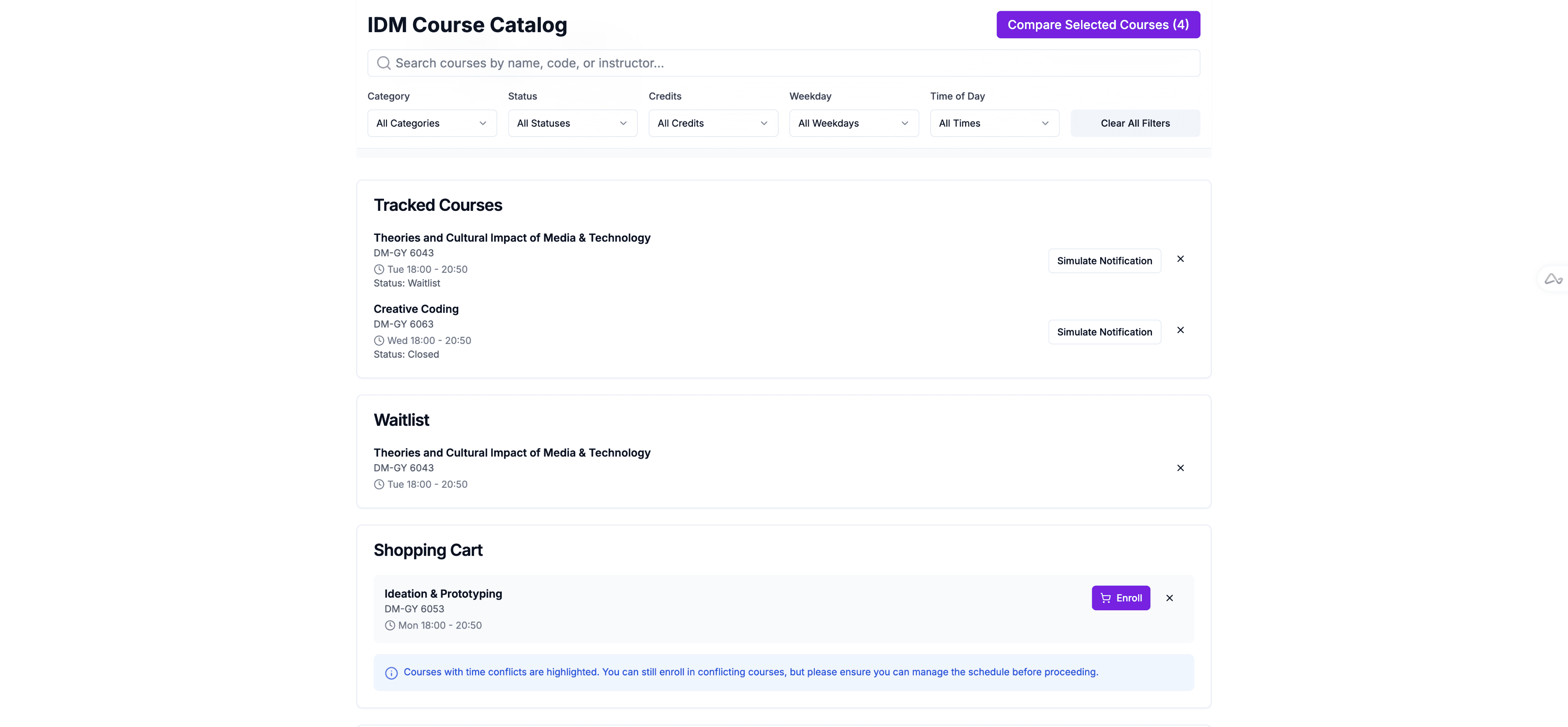
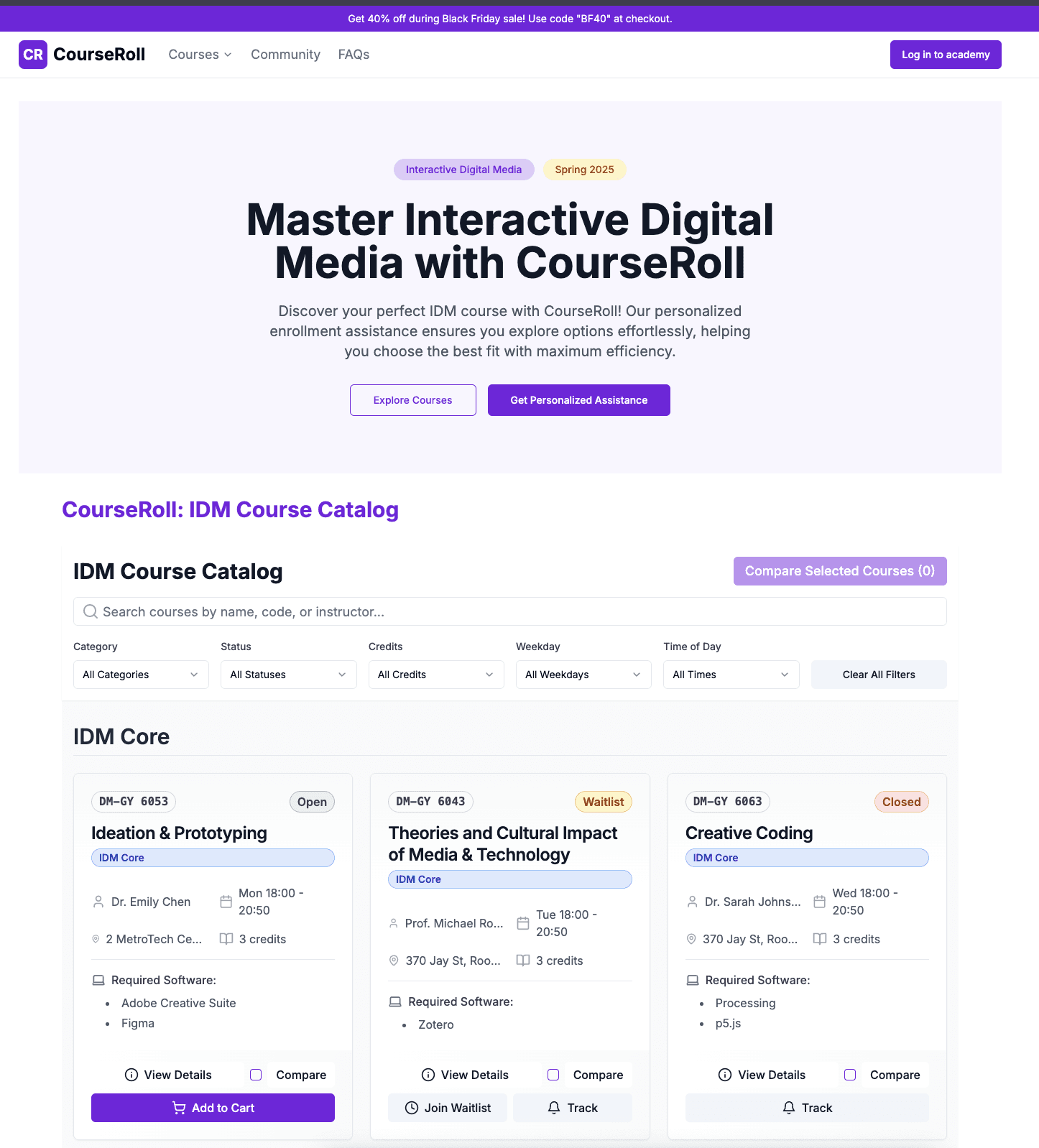
作为课程选课系统的 UX 负责人,我与 IDM 系的相关利益方紧密合作,将原本混乱、信息过载的体验,重塑为直观的界面,帮助学生更自信地做出选择。

通过重新设计核心交互模型,我把一个令人沮丧的流程,转变成学生口中“清爽直观”的体验。

  • 选课时间缩短 45%

  • 报名错误减少 60%

  • 用户满意度提升 85%

key reflections

Iteration is Critical:

最有价值的改进来自于持续的用户测试与迭代。每一轮反馈都会带来新的洞察,帮助我不断打磨和优化整体体验。

Simplicity Requires Complexity:

打造简洁的用户体验,往往需要在背后解决复杂的问题。真正的挑战在于,让这些复杂的流程在用户眼中显得毫不费力。

Data-Driven Decision Making:

每一个重要的设计决策都有用户研究或测试数据作为支撑。这种方法不仅验证了假设,也帮助更高效地确定功能的优先级。

Balance is Key:

在功能与简洁之间找到平衡至关重要。用户既希望拥有强大的功能,同时也需要一个不会让他们感到负担的界面。

Process

1

Initial
Validation

Market Research

Heuristic Analysis

Competitive Analysis

User Interview

Initial Validation

Market Research

Heuristic Analysis

Competitive Analysis

User Interview

Initial
Validation

Market Research

Heuristic Analysis

Competitive Analysis

User Interview

2

Solution Exploration

Feature Prioritizing

User Story Mapping

Quick Ideating

Solution Exploration

Feature Prioritizing

User Story Mapping

Quick Ideating

Solution Exploration

Feature Prioritizing

User Story Mapping

Quick Ideating

3

Design


Data-driven

Design-Decision making

Design

Data-driven

Design-Decision making

Design

Data-driven

Design-Decision making

4

Iteration


Rapidly Iterating

Iteration

Rapidly Iterating

Iteration

Rapidly Iterating

Challenge 1

从个人痛点到产品机会:重塑选课体验

Initial thought

作为一名 IDM 学生,我曾经在某个夜晚盯着电脑屏幕,满心挫败地花了好几个小时却仍没理清课程安排。在 NYU Albert 上排课时,我开了无数个浏览器标签来对比不同课程,结果直到完成整个选课流程后才发现——我精心挑选的两门课竟然时间冲突。

这次经历让我开始思考:

“这只是我个人的挫败感,还是其他同学也正经历着同样的困扰?”

通过研究,我发现了两个重要的机会点:

市面上的大多数平台,都以简便易用的选课流程而闻名。

市面上的大多数平台,都以简便易用的选课流程而闻名。

市面上的大多数平台,都以简便易用的选课流程而闻名。

1

1

这些平台普遍提供了更完善的选课功能,例如实时课表可视化等,来帮助学生做出更好的选择。

这些平台普遍提供了更完善的选课功能,例如实时课表可视化等,来帮助学生做出更好的选择。

这些平台普遍提供了更完善的选课功能,例如实时课表可视化等,来帮助学生做出更好的选择。

2

2

2

The opportunity

最初的调研让我发现,虽然市面上已经有各种解决方案,但没有一个能够真正全面满足学生的需求。问题并不仅仅是“如何选课”,而是需要一个直观、高效的系统,帮助学生在学业规划中做出更好的决策。

如果,我们能创造一个平台,不仅让选课流程更简单,还能帮助学生在选择课程时做出更明智的决定,会怎样呢?

就这样,这个挑战逐渐变得清晰起来:

就这样,这个挑战逐渐变得清晰起来:

就这样,这个挑战逐渐变得清晰起来:

将令人沮丧、零散的流程转变为无缝衔接的体验,帮助学生在学业规划中做出更明智的决策。

将令人沮丧、零散的流程转变为无缝衔接的体验,帮助学生在学业规划中做出更明智的决策。

将令人沮丧、零散的流程转变为无缝衔接的体验,帮助学生在学业规划中做出更明智的决策。

The breakdown

How I got there

在整合研究数据之后的某个深夜,我坐在书桌前,周围堆满了用户反馈笔记和竞品分析。问题的复杂性让人望而生畏,但我清楚我们需要一个系统的方法。

我问自己:

如何才能把这个复杂的选课系统拆解成可管理、可解决的部分?

Solution exploration
  1. Course Comparison Challenge

在梳理用户反馈时,我发现了一个明显的模式:学生们不断在不同的浏览器标签之间切换,只是为了对比课程信息。

我心里冒出了一个想法:
“如果选课对比能像网购时比产品一样直观,会怎样呢?”

基于这一洞察,我提出了三个潜在的解决方案:

  • 并排对比:同时查看多门课程详情

  • 筛选与排序功能:帮助快速缩小选择范围

  • 课程洞察:提供更多上下文信息

在从 UX 原则、开发投入与业务影响三个角度进行综合分析后,我最终选择了 并排对比,原因是:

  • 它让学生能够直接对比课程,从而简化决策

  • 技术上可行,开发成本合理

  • 与 NYU Albert 等现有系统相比,具备明显的竞争优势

  1. Time Conflict Detection

在用户访谈中,我一次又一次听到学生们提到——他们常常在流程的最后阶段才发现课程时间冲突。
于是我开始思考:
“有没有办法在学生投入大量时间选课之前,就避免这种令人沮丧的情况?”

基于这一问题,我探索了两个潜在方向:

  • 冲突提醒:当课程时间重叠时即时通知

  • 互动课表视图:用可视化日历来展示课程安排

最终,我选择了 冲突提醒,原因是:

  • 它能即时提供清晰明确的反馈

  • 开发成本更低,实施更高效

  • 为学生带来了更快速、直接的解决方案

During user interviews, I heard countless stories of students discovering schedule conflicts too late in the process.
So I was thinking "how can we prevent these painful discoveries before students invest time in their course selection?"

I explored two potential approaches:

  • Conflict Alerts: Immediate notifications of schedule overlaps

  • Interactive Schedule View: Visual calendar representation

I ultimately chose Conflict Alerts because:

  • They provided immediate, clear feedback

  • Required less development effort

  • Offered a faster, more direct solution for student

  1. Repetitive Process Solution
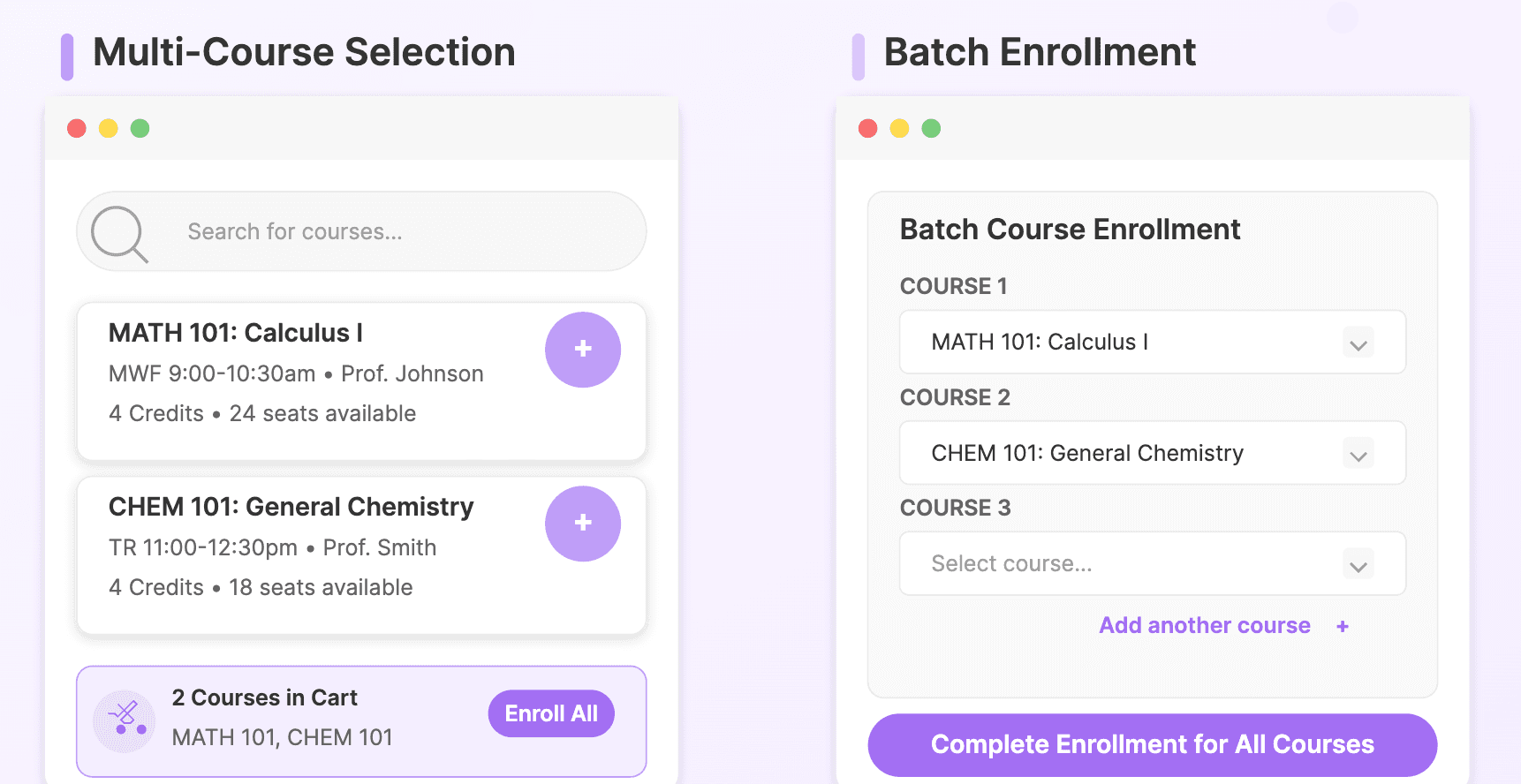
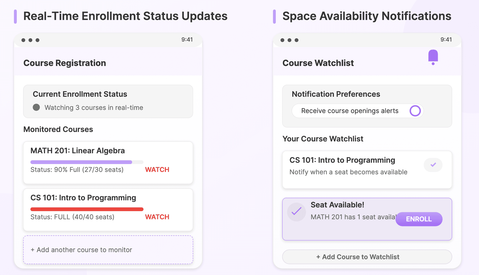
在测试环节观察学生时,我发现他们在每门课程上都在重复相同的操作。
于是我开始思考:
“怎样才能减少这些重复动作,同时又保留用户的掌控感?”

我考虑了两个方向:

  • 多课程选择:类似购物车的选课方式

  • 批量注册:一次性提交多门课程的选课

最终,我选择了 多课程选择,原因是:

  • 在减少重复操作的同时保留了用户的自主性

  • 实现方式更简单,开发成本更低

  • 提升了用户满意度,同时不牺牲选择的灵活性

During user interviews, I heard countless stories of students discovering schedule conflicts too late in the process.
So I was thinking "how can we prevent these painful discoveries before students invest time in their course selection?"

I explored two potential approaches:

  • Conflict Alerts: Immediate notifications of schedule overlaps

  • Interactive Schedule View: Visual calendar representation

I ultimately chose Conflict Alerts because:

  • They provided immediate, clear feedback

  • Required less development effort

  • Offered a faster, more direct solution for student

  1. Tracking Features

学生们常常抱怨,热门课程满员后,一旦空出名额,他们总是错过机会。
这让我开始思考:
“如何在不打扰学生的情况下,让他们及时获得这些关键信息?”

我提出了两个方向:

  • 实时选课状态更新

  • 名额空缺提醒

最终,我选择了 名额空缺提醒,原因是:

  • 它能主动告知学生新的机会

  • 开发与维护成本更低

  • 能在不需要学生持续盯着系统的前提下,提供切实的价值

During user interviews, I heard countless stories of students discovering schedule conflicts too late in the process.
So I was thinking "how can we prevent these painful discoveries before students invest time in their course selection?"

I explored two potential approaches:

  • Conflict Alerts: Immediate notifications of schedule overlaps

  • Interactive Schedule View: Visual calendar representation

I ultimately chose Conflict Alerts because:

  • They provided immediate, clear feedback

  • Required less development effort

  • Offered a faster, more direct solution for student

Challenge 2

从个人痛点到产品契机:重塑选课体验

在识别出选课流程中的核心问题后,我迎来了同样艰巨的任务——设计出真正可行的解决方案。桌上摊满了竞品分析笔记和用户反馈,我必须在其中做出关键决策,明确每个功能该如何落地。

接下来,我将带你走进 CourseRoll 的关键设计决策,看看它们是如何一步步塑造出最终的产品。

During user interviews, I heard countless stories of students discovering schedule conflicts too late in the process.
So I was thinking "how can we prevent these painful discoveries before students invest time in their course selection?"

I explored two potential approaches:

  • Conflict Alerts: Immediate notifications of schedule overlaps

  • Interactive Schedule View: Visual calendar representation

I ultimately chose Conflict Alerts because:

  • They provided immediate, clear feedback

  • Required less development effort

  • Offered a faster, more direct solution for student

Design decision 1

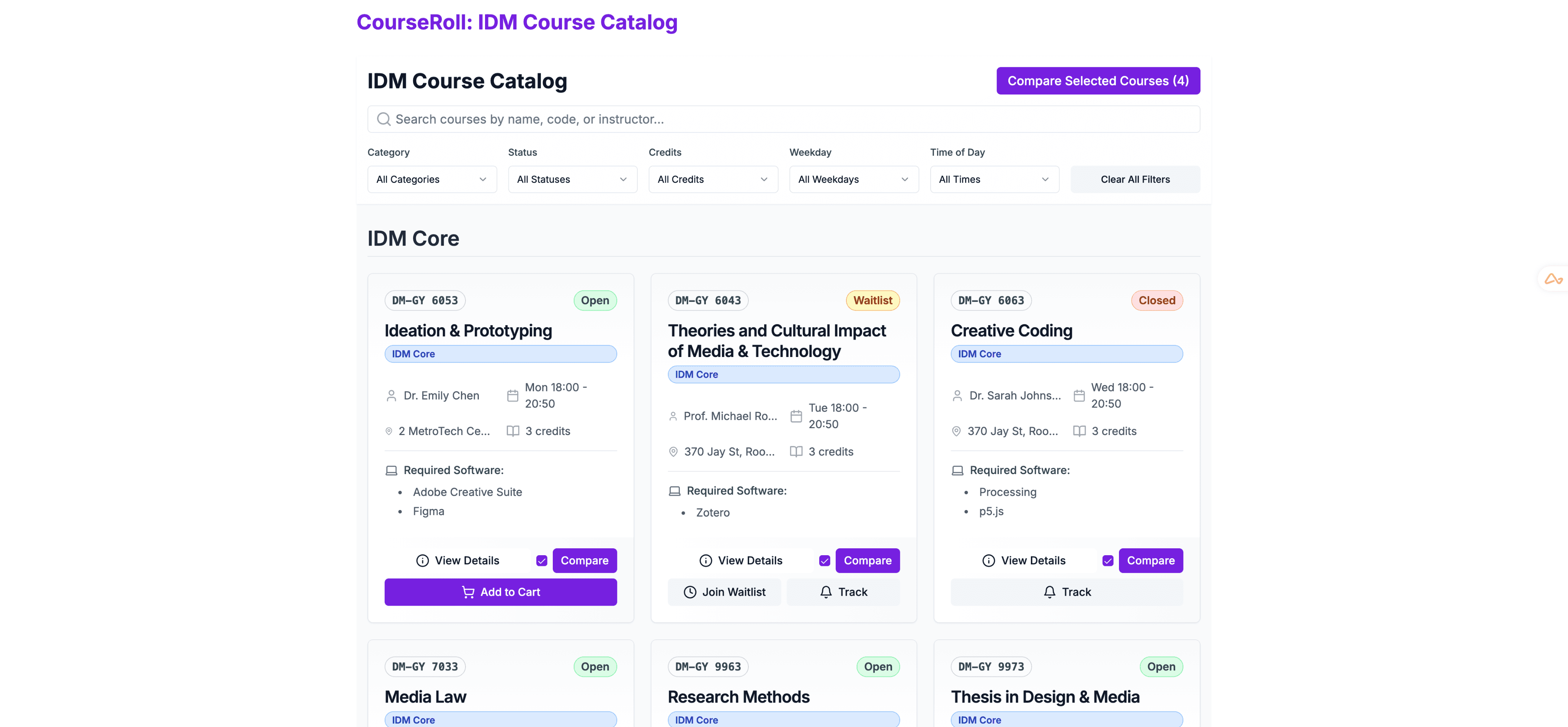
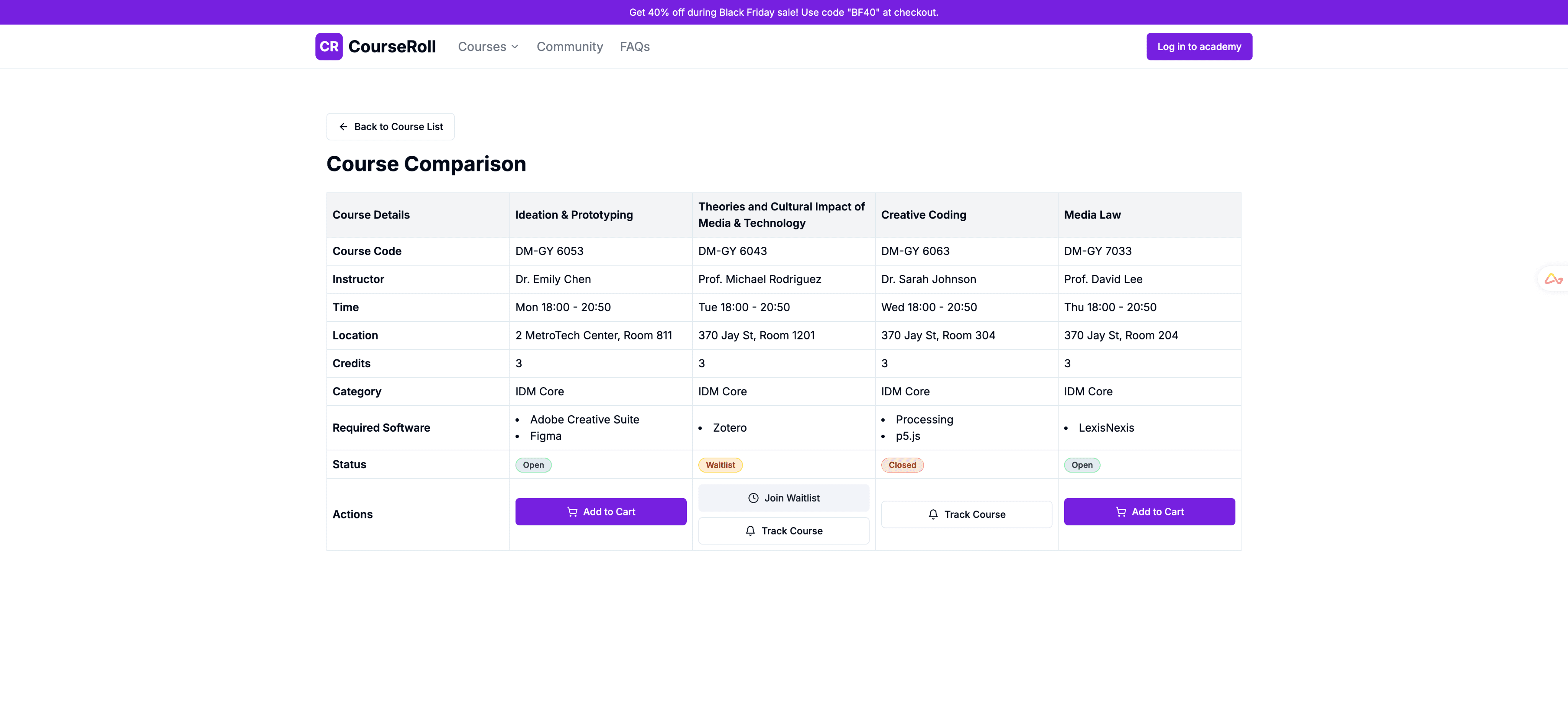
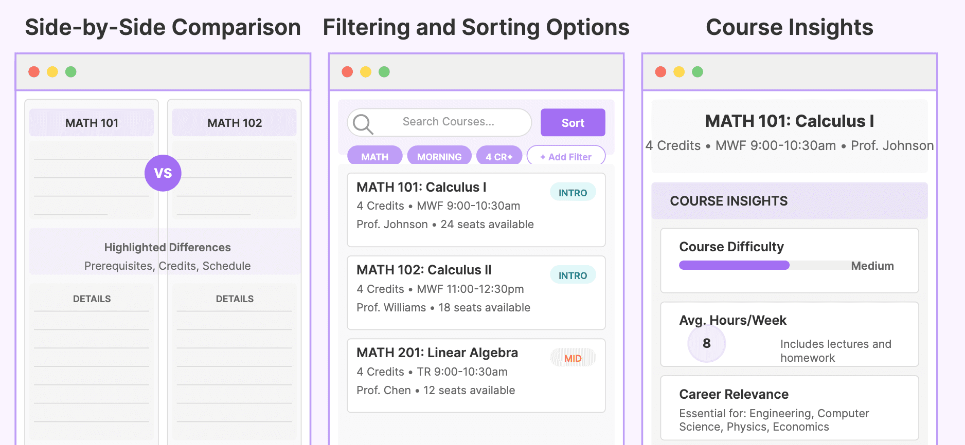
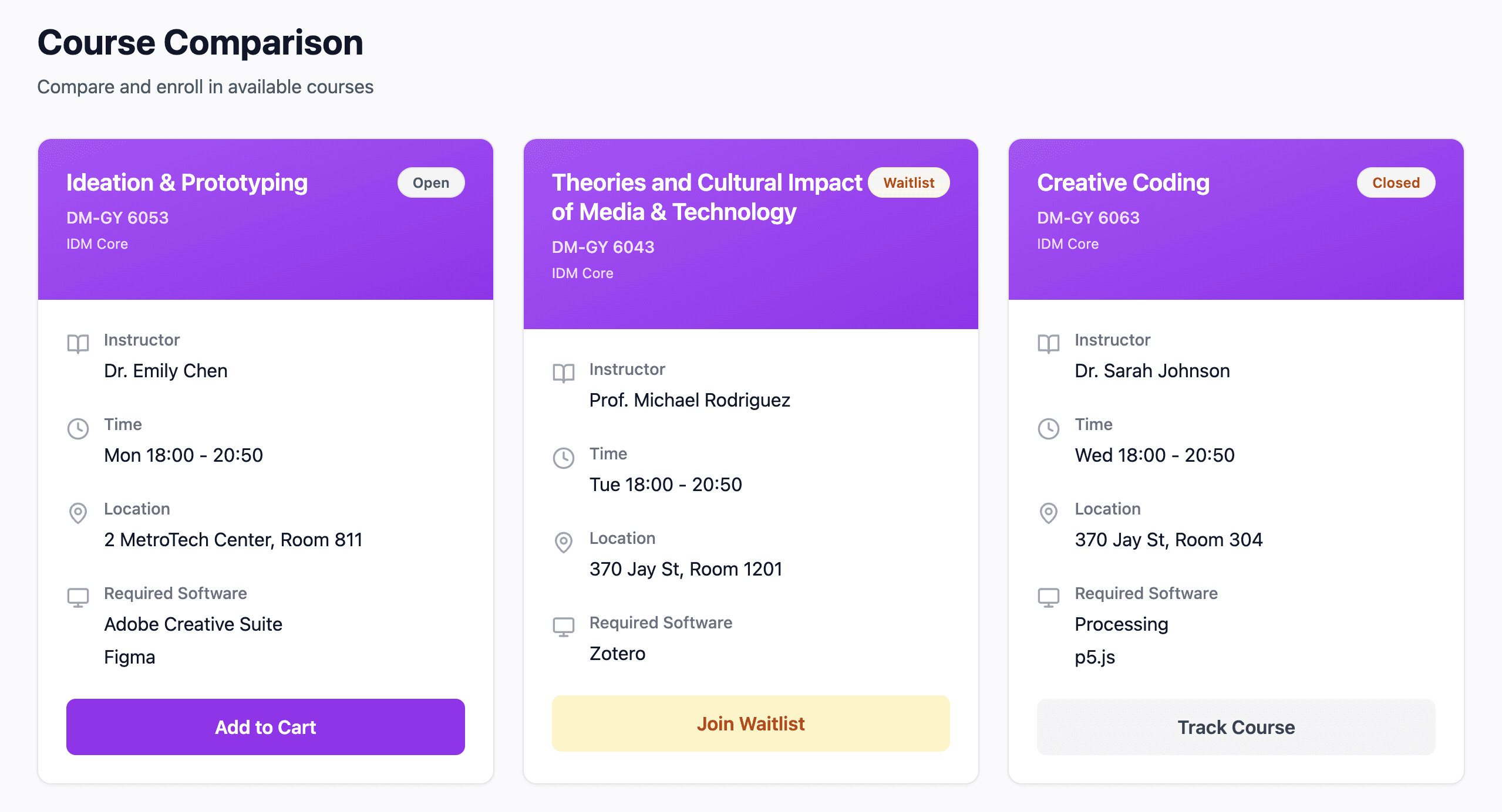
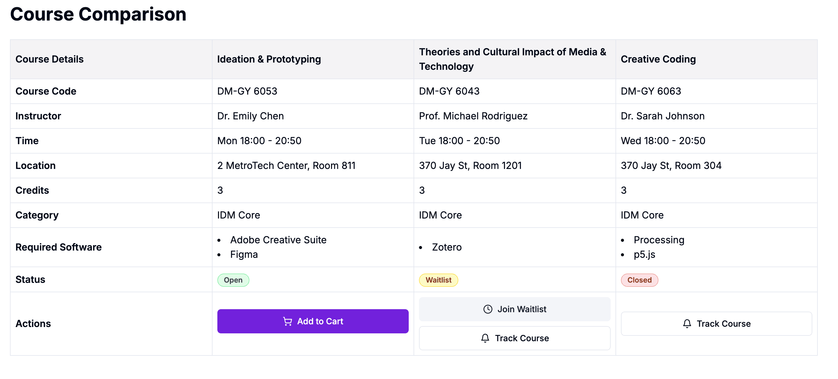
Course Comparison: Tables vs Cards Dilemma

盯着最初的草图时,我意识到:虽然卡片式布局很流行,但它可能无法真正满足核心需求。
我开始思考:
“什么更重要——视觉吸引力,还是功能效率?”

在参考了 Material Design 的设计规范并结合用户行为分析后,我发现学生最需要的是能够同时对比课程的关键信息——课程时间、授课老师、学分等。于是,我决定采用表格布局,而不是卡片布局。

数据也印证了这一选择:

  • 表格可以并排清晰地展示关键信息,便于直接对比

  • 卡片虽然在视觉上更吸引人,但会让直接对比变得困难

  • 学生可以横向浏览同一属性在不同课程中的对比,更高效地做出选择

Design decision 2

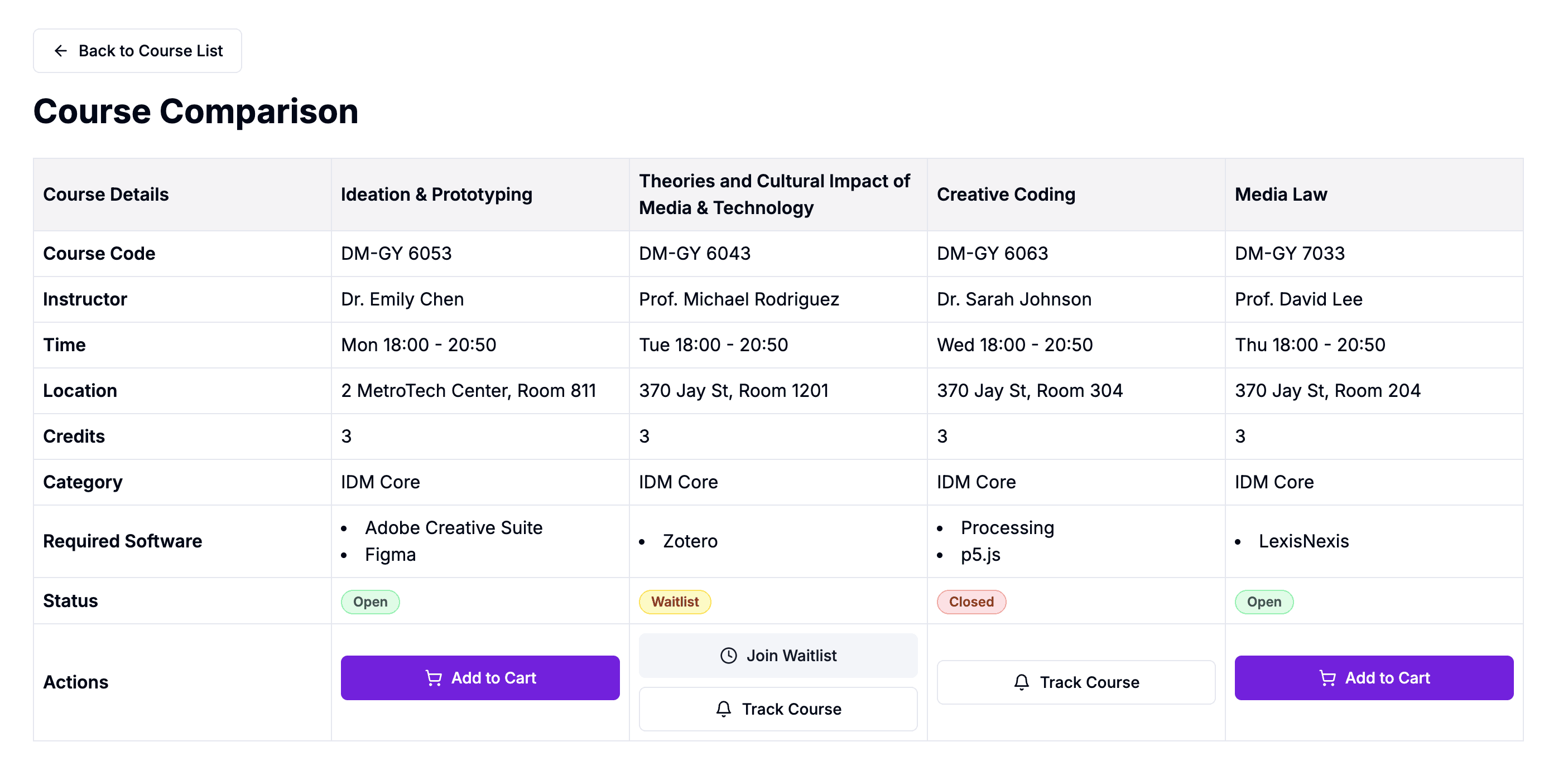
Four-Course Comparison Limit

在可用性测试中,我注意到学生在同时对比越来越多课程时,挫败感也随之增加。

这让我开始思考:
“学生在不感到负担的情况下,最多能有效对比多少门课程?”

通过对用户行为和测试数据的分析,我发现:

  • 大多数学生会自然而然地同时对比 3–4 门课程

  • 超过 4 门课程后,认知负荷明显过高

  • 一旦超过 4 门,屏幕布局也会变得杂乱无序

Design decision 3

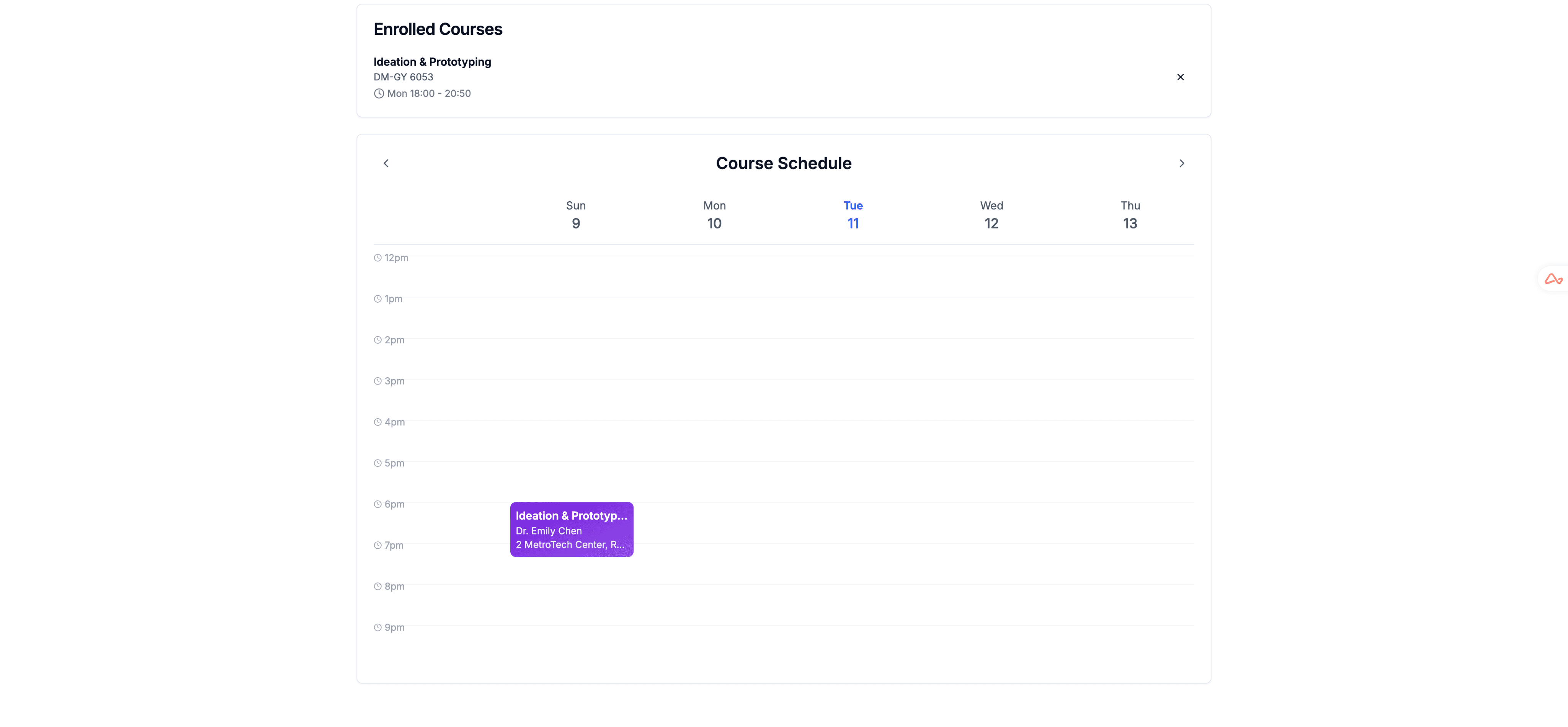
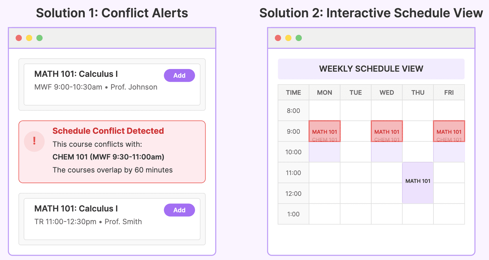
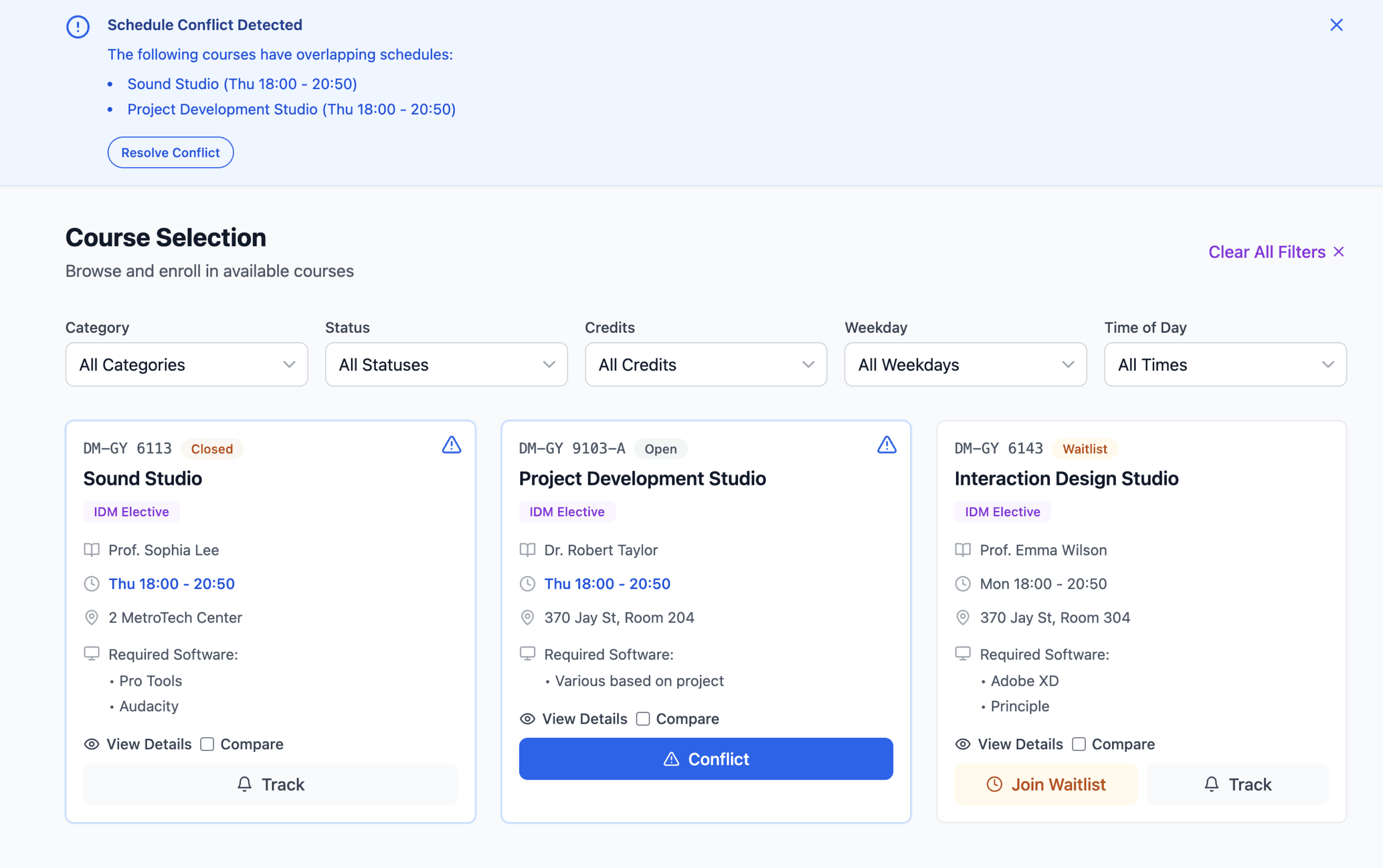
Conflict Detection: Making the Invisible Visible

在用户测试中,我注意到学生经常忽视系统给出的冲突提醒,结果在后续流程中才发现问题,产生了极大的挫败感。
这让我开始思考:
“如何在问题发生前就避免这种挫败?提醒学生的最佳时机应该是什么时候?”

基于 Material Design 3 的规范与最佳实践,我做了以下设计:

  • 显眼的蓝色横幅用于首次冲突提醒

    • Material Design 3 指南明确建议使用横幅展示重要的系统信息

    • 蓝色能传递紧迫感,但不会像红色那样带来焦虑(红色更适用于错误提示)

    • 横幅横跨整个界面宽度,几乎不可能被忽略

  • 将主要按钮标签改为 “Conflict” 以便立即识别

    • 符合 Material Design 的显性标注原则

    • 用户反馈显示,“Conflict” 一词能被立即理解

    • 热点图研究表明,用户对具体的动作词反应更快

    • “Conflict” 直接描述了问题,比委婉表述更清晰

Design decision 4

Course Selection: The Power of Simplicity

在观察学生使用带有复选框的原型时,我注意到他们表现出犹豫和困惑。界面虽然能用,但并不直观。

在参考了 Apple 的 Human Interface Guidelines 后,我决定采用 单一按钮 的方案来替代复选框,原因有三点:

  • 聚焦主要操作

    • Apple 的指南强调清晰、突出的主要操作入口

    • 单一按钮能为用户提供明确的操作路径

    • 分析发现,复选框反而造成了“选择困难”

  • 提升视觉清晰度

    • 复选框增加了不必要的视觉噪音

    • 多个选择点让界面变得混乱

    • 学生对操作顺序感到不确定

  • 优化层级结构

    • 单一按钮在界面中更具视觉突出性

    • 建立了清晰的视觉层级

    • 让主要操作一目了然

Hi-fi

© 2025 Liya Zhang | Made with

in Wonderland

© 2025 Liya Zhang | Made with

in Wonderland

© 2025 Liya Zhang | Made with

in Wonderland